How do you market in-gallery mobile apps to visitors?

This post looks at the results from some research I did for a project to develop an in-gallery app for a new exhibition (more details on that soon). I spoke to various helpful people (I’m not sure if they are happy to be credited though so will check and add them in if so. Edit: Thanks to Lindsey and Alyson of Frankly, Green and Webb! and Iain George of Antenna International) and also got some useful stuff from the MCG mailing list, thanks to everyone that helped.

Tiny museum signage that all the visitors are ignoring
Tiny boring museum sign that all the visitors are ignoring

I wanted to know: how do you market mobile apps to visitors when the app is designed to be used in gallery?

I wanted to hear what the experiences of others were, what had worked, what hadn’t. I knew that take-up for apps in gallery was often quite low, and that it was a difficult thing to get right, visitors often don’t understand the offer, don’t notice the signage, or didn’t see why they should bother.

There were some challenges with this research for a few reasons. There isn’t much shared data or evaluation about this out there. Maybe we could all be better at sharing our experiences? Also, it can be difficult to untangle how people find an app, without asking them directly. This sort of research is obviously possible, but can be time-consuming.

That said, I did get some good stuff. So, here are the key points from the research:

  • Making a good app that people can and want to use is obviously important, but one person told me that, in terms of take-up, as little as 10% of the success of an app is down to the content. Marketing and distribution is the rest.
  • Where do your visitors come into contact with your organisation’s messaging before and during a visit (and after)? Identify the opportunities to reach your audience at these touchpoints. A visit us page on the website is an obvious point, so make sure it’s there, or wherever your visitors go on your site to find visit information. Do people need to book in advance? Mention it there too then.
  • It must feel official – buy-in across the organisation is hugely important. Too often the marketing is an afterthought, or lost in a jumble of other competing messages. The app must feel like an important part of the experience to the visitor, so must be seen as important internally as well.
  • Copy and language are really important: use language that the audience will understand and find appealing. How can you be sure you have the right message? Test it! Take it out into the gallery and ask visitors what they think the name or tagline means. Or describe the app and ask what words they would use to describe it to a friend.
  • Address audience concerns. Visitors are worries about battery life, data usage, making noise in the gallery and many other things. Find out what those concerns might be and address them (not defensively, mind) in the marketing. Maybe explain that it is a one off download, or that they can use the wifi, or you can provide cheap headphones in the shop.
  • Convey the benefits. Don’t assume that the audience do the mental legwork in interpreting what the app will add to their experience. Be really clear and concise about what those benefits are.
  • Make the target audience clear. Is it for families? Say so. Families in particular are often looking for child friendly activities to do in gallery.
  • Signage is obviously important. But one sign is rarely enough, and one mention on a general sign is going to be ignored by the vast majority. Place specific, appealing, signage early on somewhere prominent. Reiterate in gallery.
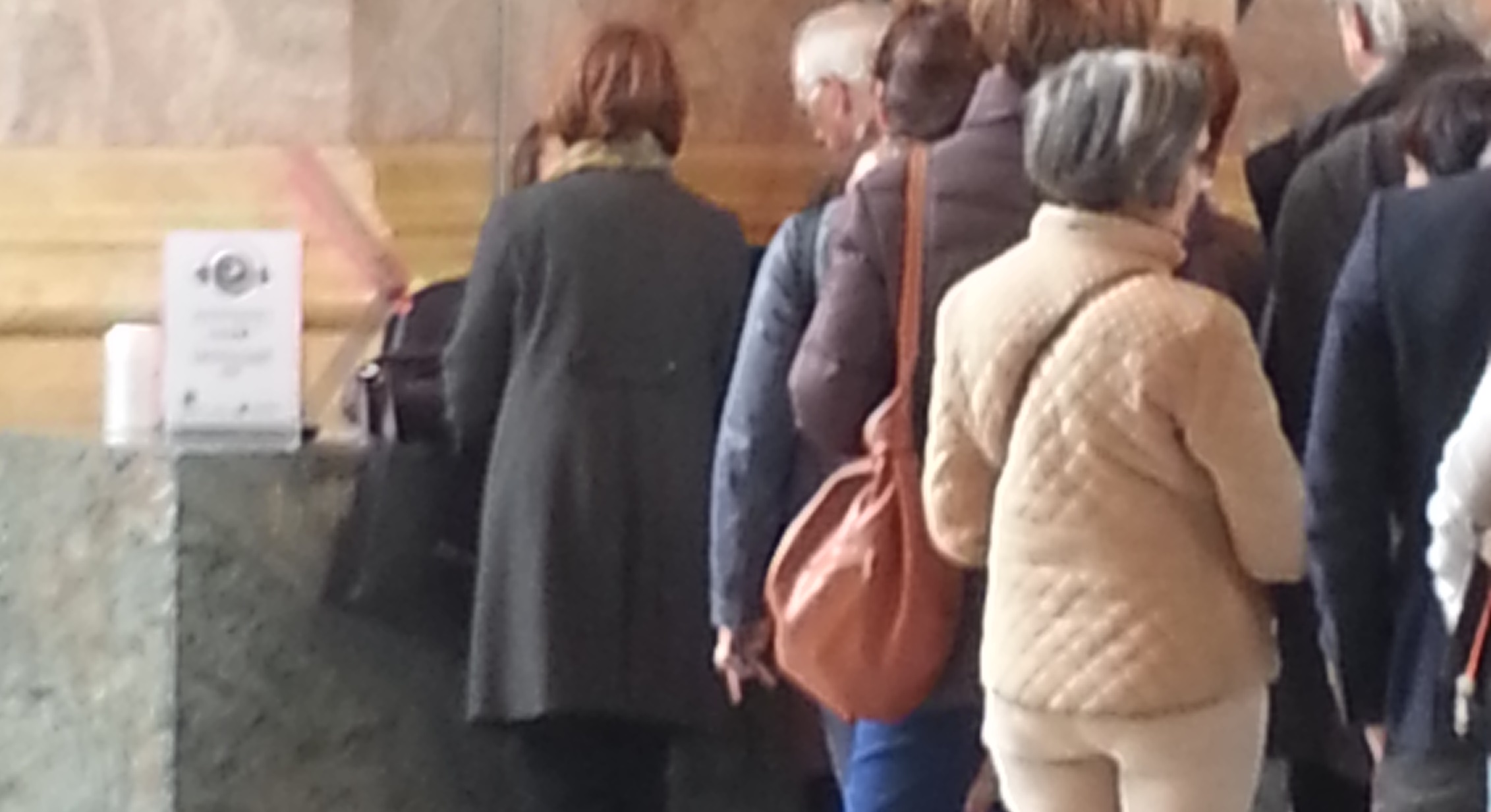
  • Use the queues! If people are having to wait for a while for tickets, DEFINITELY use this opportunity to tell them about the app. This may also be a good point to get them to download it. Use it to build anticipation.
  • Use the mobile splash page. Andrew Lewis at the V&A has done some great research on this. If visitors can log into your wifi, use the login page or the page they are redirected to to tell them about the app and mobile offer. One catch though, you still have to market the wifi, as many visitors (perhaps the majority) are not aware that museums have it.
  • Use print. Don’t forget the old fashioned methods. Create a leaflet about the app, hand it out with tickets, or hand it out in the queue. Or place it in gallery, or use it at events. Use it to market the app and provide some guidance for those who may be less tech savvy.
  • Make sure gallery staff are aware of the app and trained in how to use it. A common issue, very understandable in museums with volunteer staff with a high turnover, is that the visitor cannot get support or information about an app from a staff member because they know nothing about it. The whole thing will run a lot better if visitors can ask any staff member about it. In gallery staff are also well place to identify visitors (again, perhaps families especially) who might benefit from the app and can even approach them to suggest it.
  • For teacher audiences, there are more specific needs. They want to plan in advance, so you will need to be more proactive about reaching them before the visit, when they get in contact to book. Or in more direct marketing before they were even thinking about it.
  • App Store and Google Play store promotion is difficult, you should obviously make sure it is easy to find and well tagged etc, but browsing through the App Store is not how most visitors will be attracted to using an app of this sort so don’t rely on this.
  • Press and PR is important, of course. Target the right audience as you would for other marketing. But may need to make it more about the app in the context of the whole visit, as you are also having to do the work to convince people to come in the first place, they aren’t already there.

What do you think? Do you have different experiences or disagree? Or have anything else to add?

Why I’m fed up with digital projects (and why I’m not): a rant

I’ve felt a little rant bubbling up in me over the last few months: a sense of disquiet about digital, a jaded annoyance about wasted time and resources and opportunities squandered. Today I was reminded about an old project that was the epitome of digital idiocy, one of those thoughtless knee-jerk “we must have an app!” projects that make me want to throw a toddler tantrum, kicking and screaming “but who is it for?” until someone agrees to at least do a bit of audience research or string together a minimally viable set of objectives. And that reminder seems to have brought it all to the surface, so here goes.

I am fed up of seeing people and organisations produce digital rubbish: poor apps, clunky games, badly designed microsites and other half-arsed online, mobile and technological systems and whatnots. I am fed up of people who are smart about digital, who think about users, who ask the right questions at the start, who embrace technology without fear and understand how to apply it, being over-ruled by people who’ve just bought an iPad for their kids and now assume that everyone has them and that this is all the justification they need to insist upon spending £50k on a new app for their organisation (an app for who?! For what?!). Moreover, I am fed up of projects that fail being brushed under the carpet, with no evaluation or debrief that enables everyone involved to learn from mistakes and build something better the next time.

It makes me sad to see money and time being wasted, when it’s usually avoidable, and even more so if nothing is then learned from this. It makes me especially sad, because the technology we have available to us today is AMAZING. My phone is able to do astonishing things and the computers I use have incredible firepower (I still remember how exciting it was to get a floppy disc drive for my BBC micro, now look at them!).  It feels like there is so much potential and so much more that the technology we have could allow us to do.

It’s not like there aren’t enough examples of brilliant products, apps, games, and other applications of these technologies out there to learn from. Too many to list. But many many many more that have been an utter waste of everyone’s time from the beginning because they just didn’t ask some basic questions about who and what their product was for, and test it with that in mind along the way. Isn’t that a bit sad?

I know it’s not easy. That there is a degree of luck in rising above the huge amounts of competition online or on on the app store, that things beyond your control can go wrong during the development of a project, and that there are some times you need to go on your gut instinct, and that’s not infallible. Goodness knows I’ve made every kind of mistake creating digital things over the years, as have most people working in this constantly changing field. And I will continue to make mistakes, as will most people etc.

So I’m not claiming there is a perfect process, but there are better and worse ones, and there are definitely massive howling alarm-bell-ringing clangers that should be sending up the red flag right from the start. The “we need an app, never mind who for”, the “we’ve got all this content, let’s just stick it online, people will come to us”, “let’s create a whole new portal for something that already exists”, and so on. And sometimes it feels like we aren’t moving on from this, these whack-a-mole stupidities keep popping up over and over again and just will not die.

Why is that? In a recent conversation with a fellow person-who-works-somewhat-indeterminately-within-“digital” we discovered we’d both been feeling this slight ennui with the field. This sense that it wasn’t meeting its potential, that a lot of rubbish was being made, and that it was hard to see how to make things better. We wondered if it it might be that digital is constantly being driven by the hardware makers, by Apple and console or computer companies and that their vested interest in creating new stuff for us to buy means we’re always just playing catch up. Why do we let this dictate the pace? Where is the chance to take stock and develop best practice?

My experience as a freelancer over the last few months, applying for funding and responding to ITTs, has also been eye-opening. The systems and funding in place for making digital stuff are really broken. If you were trying to design a process that would result in crappy digital products, you’d make people (who may not be particularly digitally literate) scope everything out and pin it down before they’d ever been able to build anything or ask their audience about it, only then engage an agency who are the real experts but can’t change the scope, and then make the project team go through a month long change request process if they want to develop the project in a different direction from the scope based on the evidence as they start building and testing things. Which is exactly the process in place in a frighteningly high number of places. The old models for procuring new infrastructure etc just do not work for digital projects, and it’s hamstringing them from the very start.

Plus money, of course. Not enough money, or not tailoring the project to the actual budget available.  I’ve had this rant elsewhere. I seem to spend a lot more time these days telling people not to make a digital thing. Would it work just as well as a piece of text? As a printout? As a physical activity? Or a really simple website? Don’t overreach if you just can’t afford it, do something straightforward and proven.

But at the same time I love working on and seeing others working on brilliant digital projects. The reach you can get, the amazing response in terms of both scale and thoughtful quality, the sense of shared global experience, the playfulness and the utility, when done well. So, how do we do more of these?